
F3i — IA Redesign & Design System
F3 Innovate is a Central California nonprofit advancing agricultural infrastructure. My agency was brought in to redesign their public website and build an event collateral system ahead of a major stakeholder conference. I improved the site's information architecture to better guide distinct audience groups.

Problem
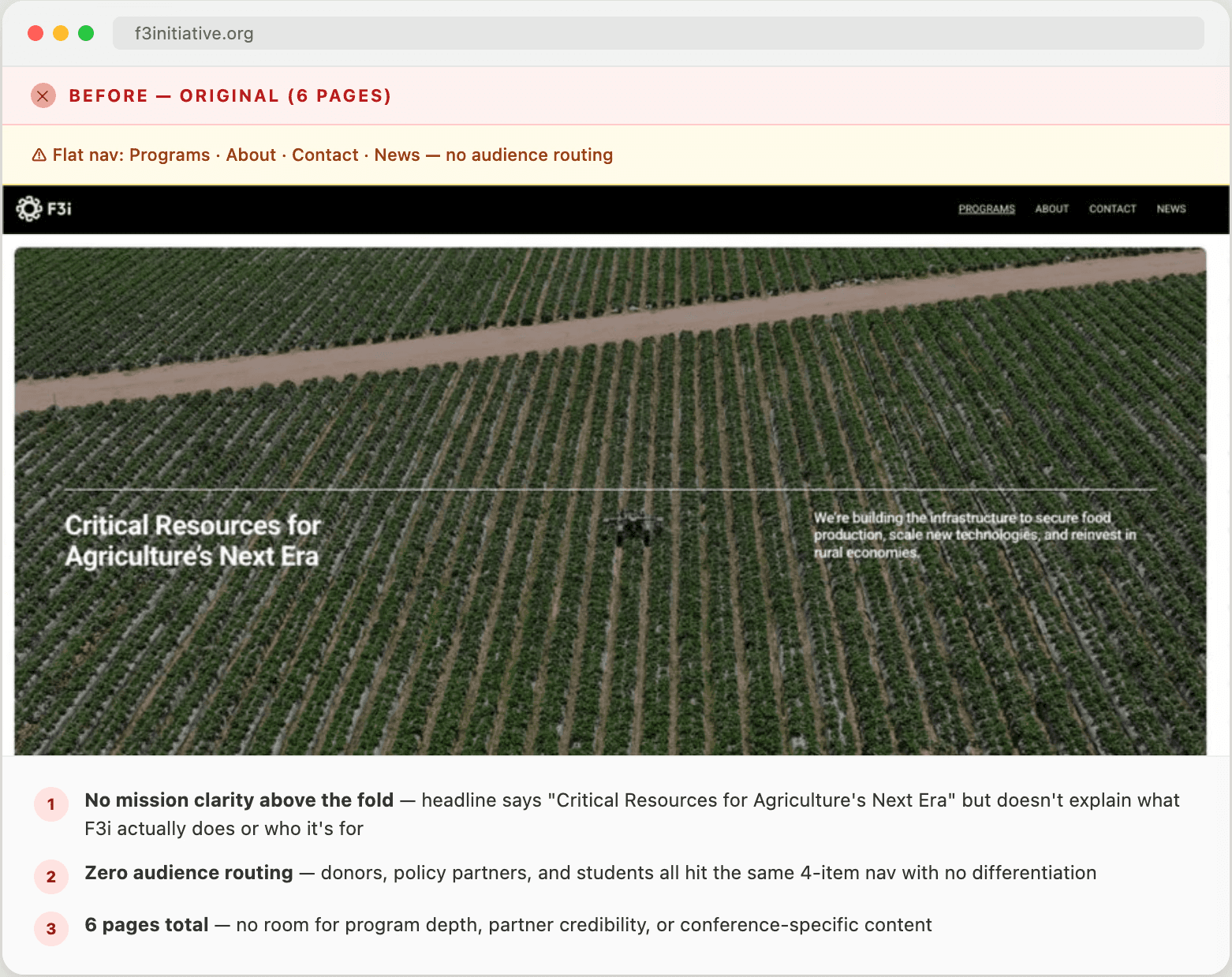
The site couldn't communicate what F3i does or route vistors to what they needed.
F3i's leadership came to us with a direct diagnosis: people visiting the site didn't understand what F3i actually does. For an organization trying to build credibility with government policy partners, attract donors, and connect with the farming community, that's a critical failure. The site existed but it just couldn't do its job.
The timing made this urgent. The stakeholder conference was the organization's highest-visibility moment of the year. The site would be the first thing attendees looked up before walking into the room. A confusing website wasn't just a brand problem, it undermined institutional credibility at the exact moment it mattered most.
Under 4 weeks to conference
No room to run a full discovery process. Decisions had to be made with the information available and iterated quickly.
Inconsistent brand assets
Existing brand assets had no system behind them. Logo, icons, colors, and graphics, but no components, no rules, no web-ready anything.
Users
The site served three audiences with different needs and different levels of familiarity with F3i:
Government and policy partners
The conference was built for them. Needed to quickly grasp F3i's scope and relevance to their policy priorities. Credibility signals mattered more to this group than anything else.
Donors and funders
Needed proof of impact. What F3i does, what it has built, why it's worth backing. Mission statements don't move this audience; concrete programs and outcomes do.
Students and companies
(Agtech startups, farming enterprises) Needed to know specifically what F3i could do for them. Not an organizational overview, but a direct path to the relevant program.
Users
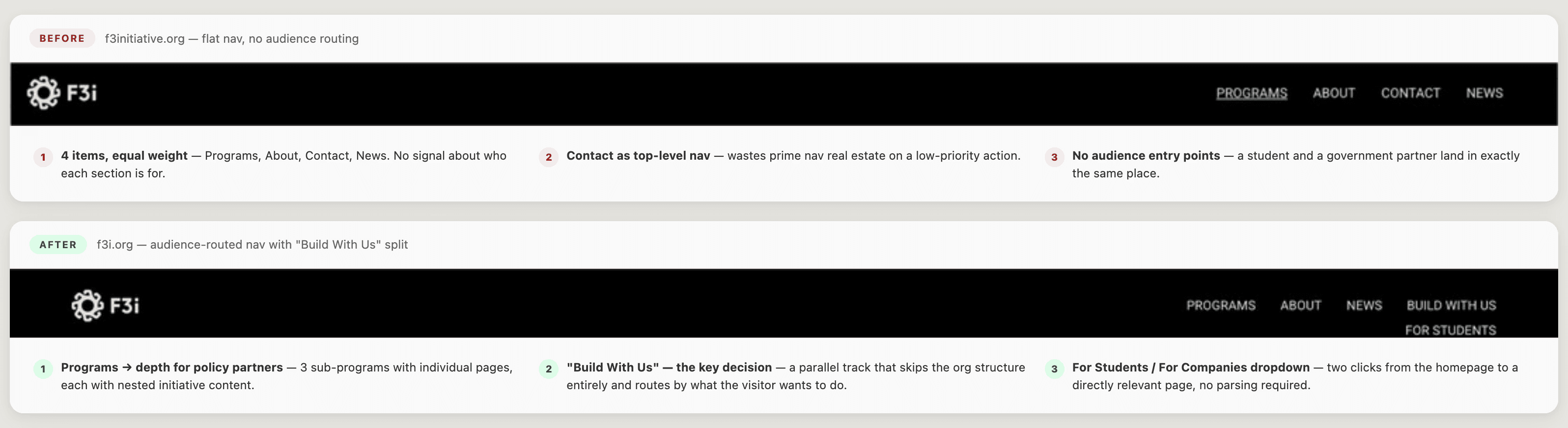
Flat 6-page site to an audience-routed structure
The original nav treated all vistors equally. The redesign directed each audience: policy partners, donors, students, companies, to the content built for their specific goals.
Splitting the nav by audience, not by content type.
F3i's original brief organized the site around what the organization does internally. The redesigned navigation adds a 'Build With Us' section split explicitly into For Students and For Companies, pulling audience-specific content out of generic program pages and giving each group a direct entry point.
This was a deliberate departure from the inherited structure. A potential donor and a student looking at the same Programs page were going to leave with different levels of confusion. Separating them in the nav resolved that without requiring separate sites.
Building the design system before the pages.
With 20+ pages to deliver in under four weeks and brand assets arriving mid-project, I made the call to establish a visual system first rather than designing pages individually. When new assets arrived mid-project, I updated the system once and the changes propagated.
Without this decision, mid-project asset changes would have required retrofitting every page, which, on a four-week timeline, would have meant shipping inconsistent work.

Original Pages before Redesign
Impact

Solution
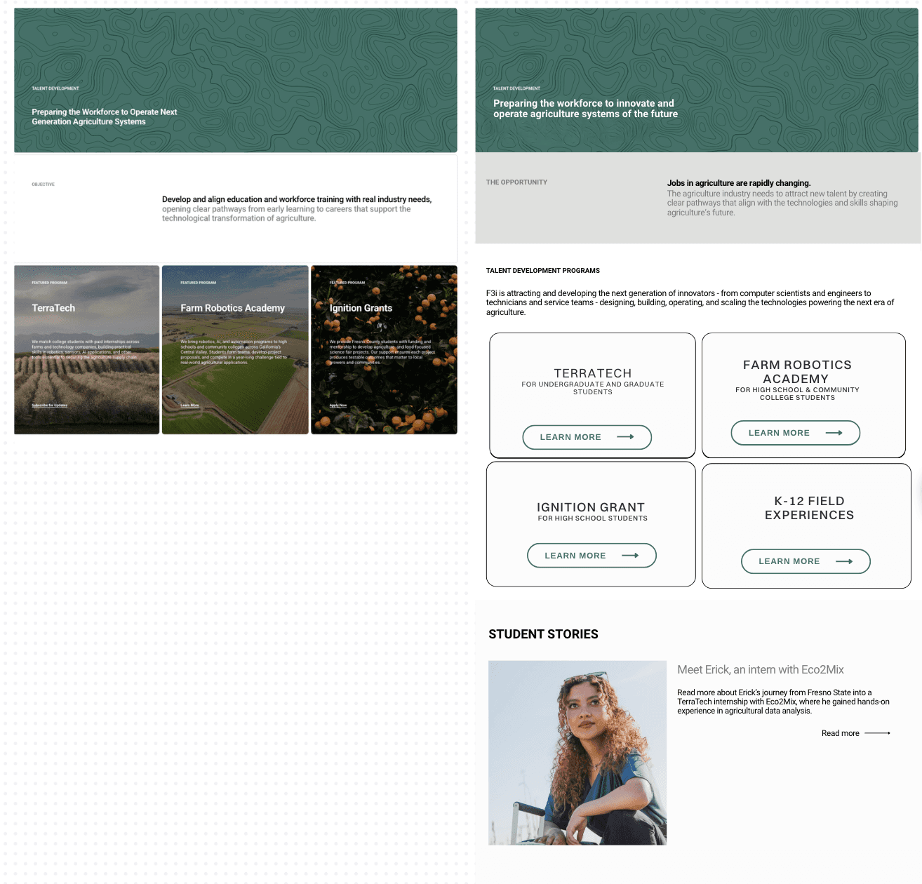
A 20+ page Squarespace site organized around three program pillars: Talent Development, Commercialization Engine, and Catalyst Fund, with audience-specific entry points built into the navigation.
A complete event design system (posters, print collateral, digital assets) built on the same visual foundation, so every conference touchpoint pointed back to a site that could hold its own.
The homepage leads with the scale of the problem F3i exists to solve, then explains the organization, then routes visitors to the content relevant to them.
